
Issue - text on banner too big
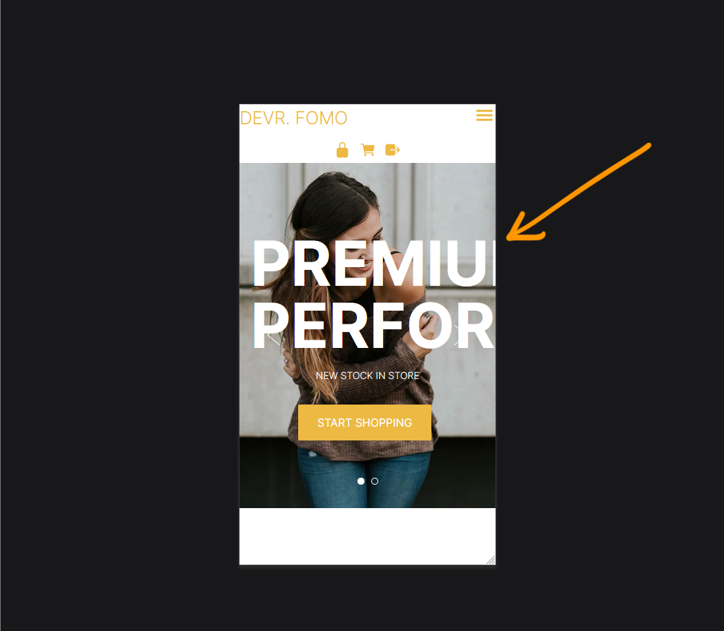
Issue - text on banner too big
- Large text set on desktop mode goes off the screen on mobile.
Screenshot above: Our website viewed on mobile mode in firefox - CTRL + SHIFT + M
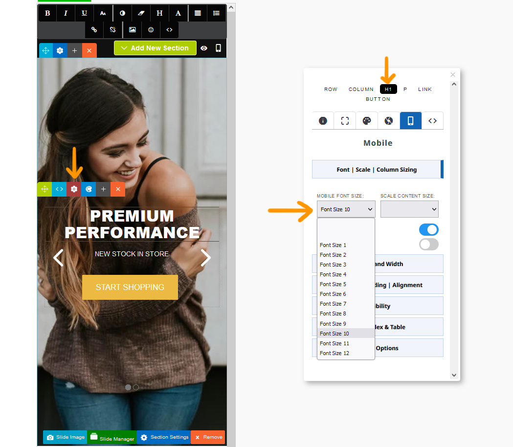
Solution - Set a mobile font size via Style Editor
- Click the RED COG icon to launch the Style Editor
- Navigate to the required element and set a mobile font size.
Screenshot above shows the editor in mobile mode. H1 selected and a mobile font size of 10 applied.
Issue - text on banner is crammed together
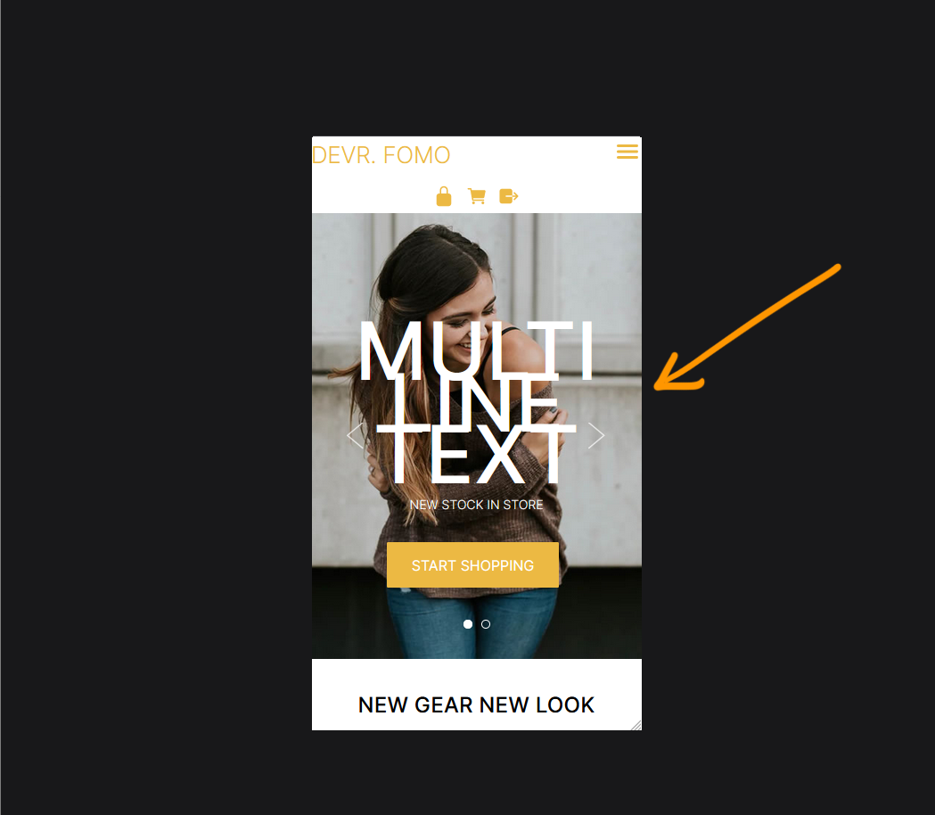
Issue - text on banner is cramming together
- Large text set is wrapping with the incorrect line-height screen on mobile.
Screenshot above: Our website viewed on mobile mode in firefox - CTRL + SHIFT + M
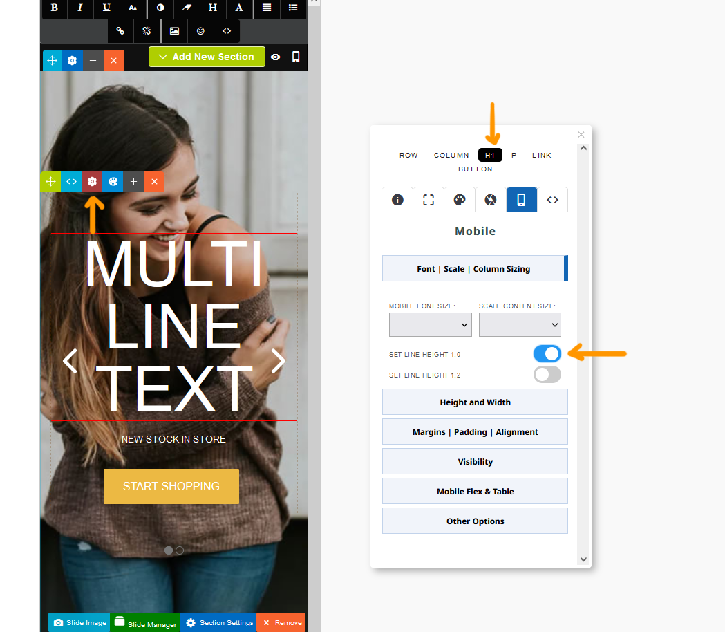
Solution - Set a mobile font size via Style Editor
- Click the RED COG icon to launch the Style Editor
- Navigate to the required element and set a mobile line height of 1.0 or 1.2.
Screenshot above shows the editor in mobile mode. H1 selected and a line height of 1.0 enabled.
Issue - content is showing 1 column not 2 down the page
Issue - content is showing 1 column not 2
- Multi-column content showing across the editor is showing in one column the screen on mobile. This is the default setting for snippet - block content but can be overriden.
Screenshot above: Our website viewed on mobile mode in firefox - CTRL + SHIFT + M

Solution - Set a mobile column size via Style Editor
- Click the RED COG icon to launch the Style Editor
- Click the ROW element if not selected and choose your column size.
Screenshot above shows the editor in mobile mode. row selected and a 2 column layout selected.
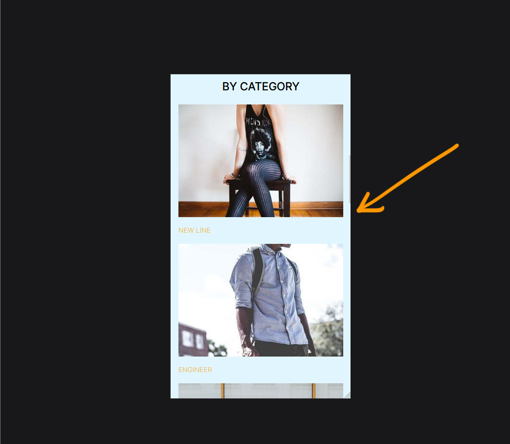
Issue - too much space between content
Issue - too much space between Contentbox elements
- Large vertical spacing set on desktop mode looks gappy on mobile.
Screenshot above: Our website viewed on mobile mode in firefox - CTRL + SHIFT + M
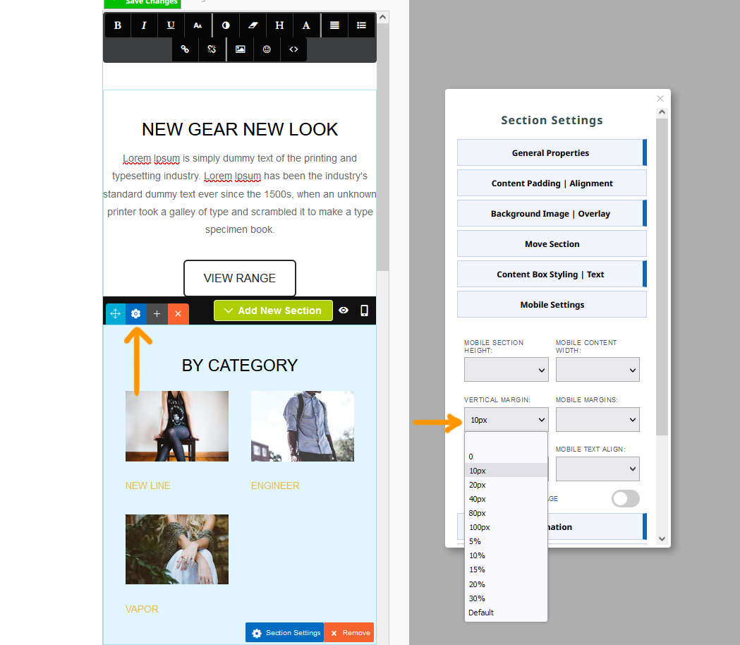
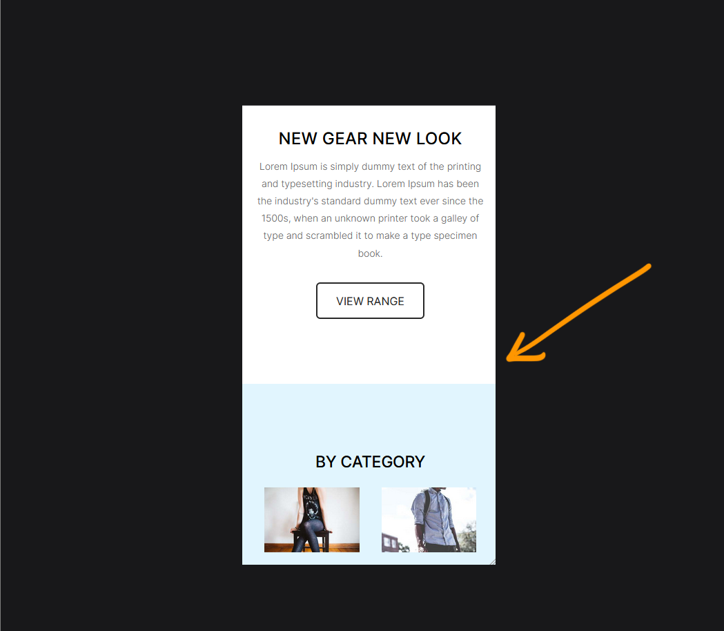
Solution - Set a vertical margin via Contentbox Settings
- Click the BLUE COG icon to launch the Contentbox Settings popup.
- Select the required spacing from the vertical spacing option.
Screenshot above shows the original 80px spacing on desktop overridden with a 10px margin for the section.